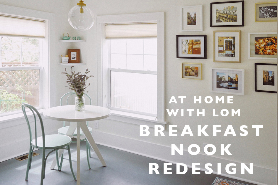
As we’ve been renovating our 1925 Dutch Colonial house in SE Portland over the past 2 years, we’ve slowly moved through projects, both large and small, hiring contractors and DIY’ing things. But throughout the scope of our renovation, the one room that alluded me for a long time and that I wondered what exactly to do with was our breakfast nook. This room off of our kitchen and connected to our living room was an addition by a previous owner and while the space is decent in size, the layout is odd. It has large windows that take up a lot of the wall space and lots of doors and connecting spaces that filter through here. Honestly, we still don’t use this space a lot, but at least I feel like we landed on a final design idea that I do like. And while it mostly serves as a walk-through space (from our garage and backyard to the kitchen, basement and living room), through all the stages of the renovation, I do really like how it turned out! Here is our breakfast nook redesign and how we handled it!
Step 1 : Find an Overall Aesthetic for the Space
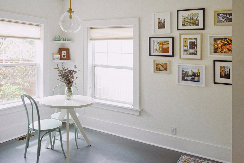
It took me a while living in the house to figure out what overall aesthetic I wanted for the breakfast nook. And while our homes always have a lot of nods to our travels and Europe specifically with artwork and knick-knacks, I came to the conclusion that I wanted the breakfast nook space to feel, in essence, like a European café. I wanted to feel like it’s a space that I could sit and eat a croissant and have the general feel of a casual European space. In the end, it does really feel that way and I love it!
Step 2 : Clean + Paint
The whole space was already painted white, so I didn’t have to do much work there, however the window frames needed repainting and I ended up painting the floor (see more about that process in this post). But more than anything, the space just needed a really deep clean! As a walk through space from our garage and backyard, it sees a lot of foot traffic so making sure the space was super clean before we started the renovation was important!
Step 3 : Find Unique Pieces based on Your Aesthetic
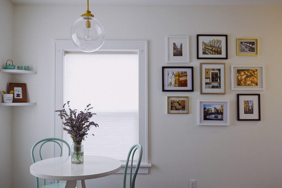
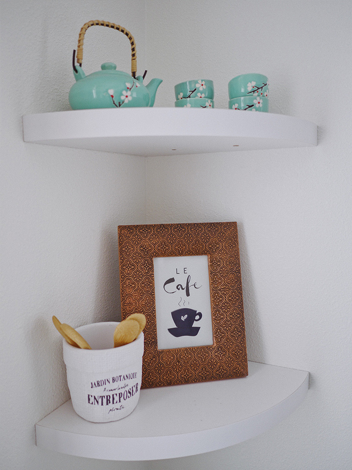
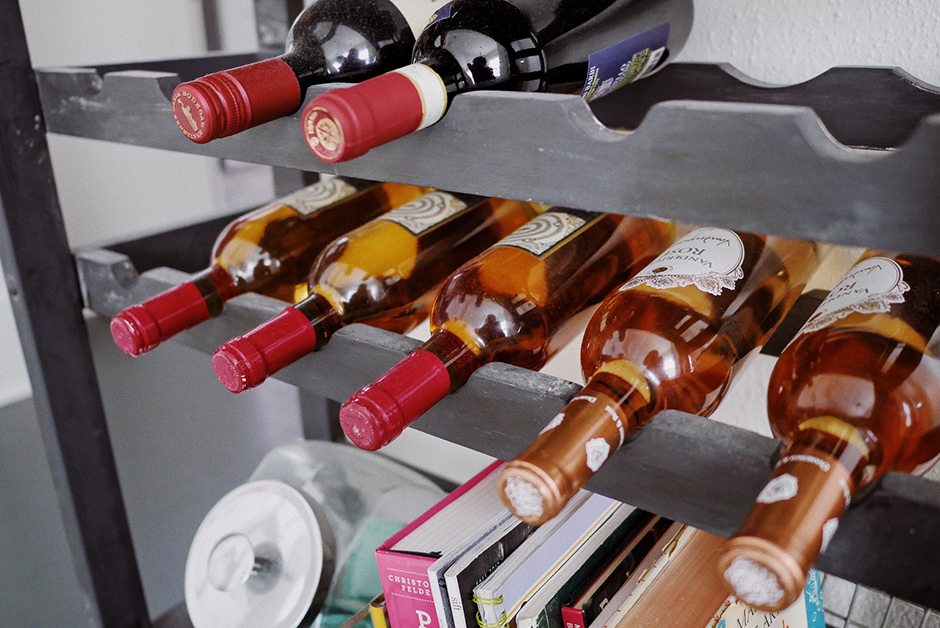
Finding furniture for this space was actually a long process, to be honest. We didn’t even put any furniture into the space until about 8 months after moving in and even after that, we did it slowly and added pieces deliberately as we found them. First we added the small white table from West Elm because we got it on a great sale. Then we found the café chairs in the same aqua color that became my go-to accent color for the adjoining kitchen. Next we added the corner shelves, artwork featuring some our favorite shots from Europe and that café and foodie feeling from our travels. And finally, we found the wine shelf and storage piece at a vintage store here in Portland and it was so perfect for the last empty wall of the space.
Then we let the space sit for a while. A couple months ago, I tackled painting the floor tiles in the kitchen and this space and ordered rugs. Then only a couple weeks ago, we finalized everything with a new light fixture. In the end, each piece came from a different place but they ended up melding so well together and created a really unique space in our home. And even though it took a long time to finish this space up totally, I do love how it came together in the end.
The Final Result
I’m super happy with how this space turned out, even if we don’t use it all that much. The design though ended up being exactly what I imagined in my head when we started out and I do love that it’s a casual, cute spot in our home to sit, look out into our back garden and just take a moment during a busy day to pretend I’m in a European café somewhere.
All the Items We Chose for This Space
These are the touches in this space that we purchased to do this renovation project:
