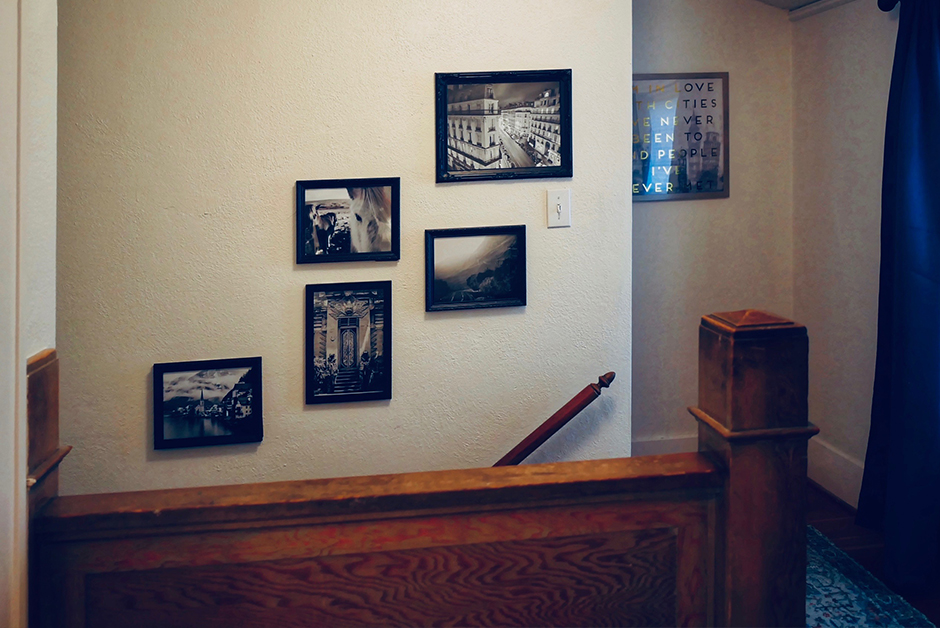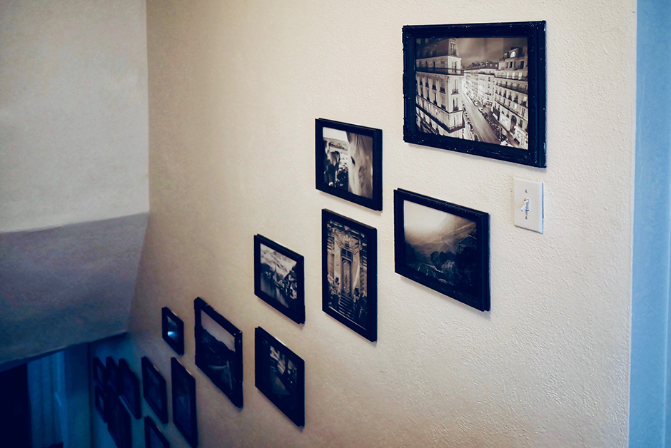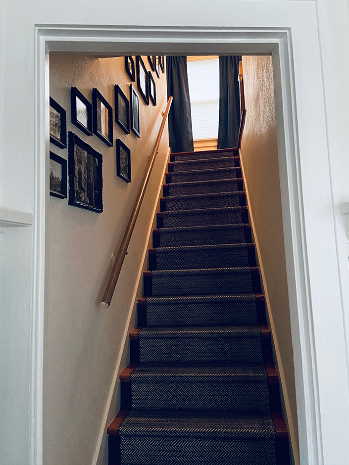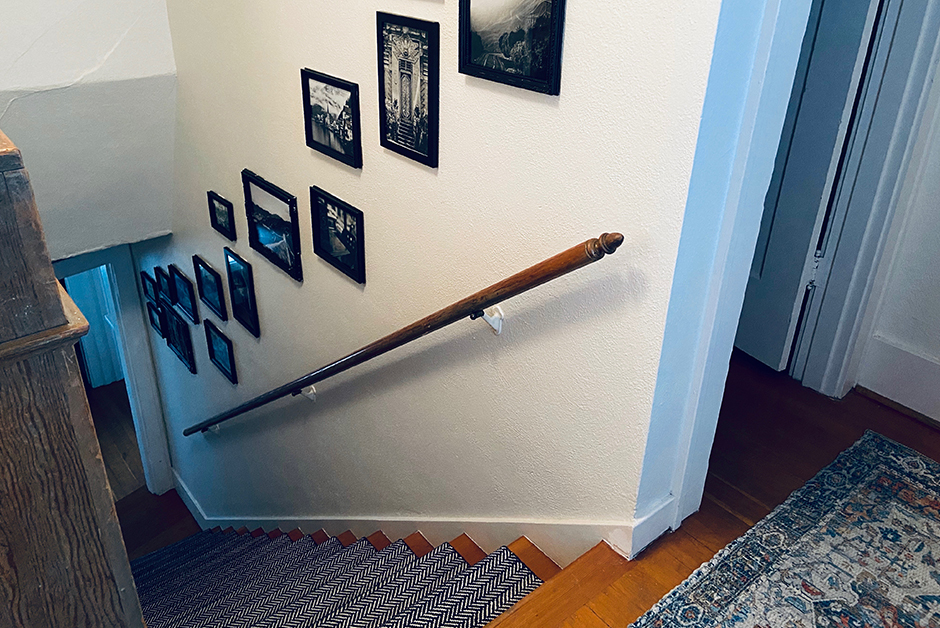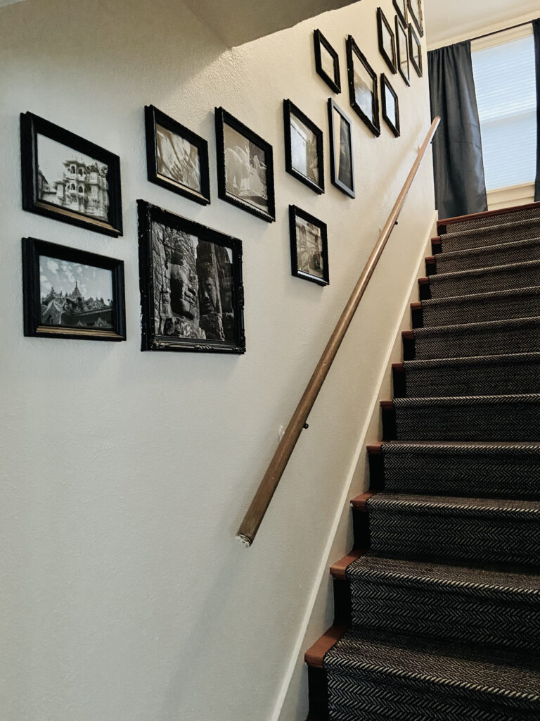
We’ve been in our house for 2.5 years now and it wasn’t until COVID hit and it forced us to stay home as much as we are to make me realize that some spaces in our home really needed some love. Our stairwell was one of those places and to be honest, for the first 2 years it barely bothered me that I hadn’t bothered to hang anything on the walls going up the staircase. One day during quarantine though, I was missing travel so badly and decided that what the stairwell really needed was a gallery wall of some of our favorite travel moments. So today, I’m sharing how we went about creating a travel gallery wall in our staircase and everything that went into it!
Step 1 : Deciding Which Photos to Showcase
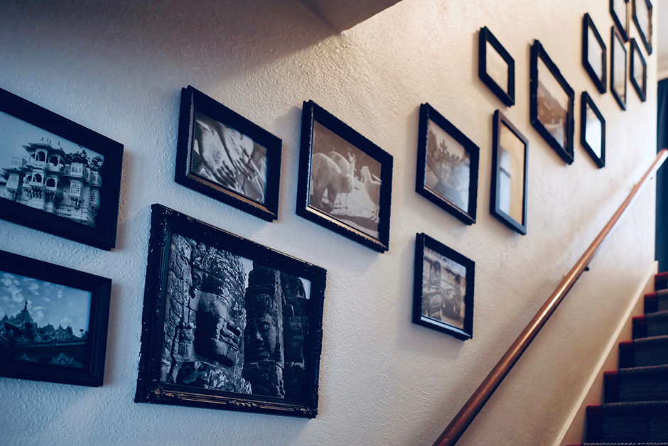
The first thing I decided was that I wanted the photos in this gallery wall to be more small moments we’ve had while traveling versus larger landscape or cityscapes like most of the rest of the art in our home. I wanted this to be less “art” and more “memories.” I started going through my archives of photos and deciding which ones to include. I also decided I wanted to do them all in black and white so that also helped me decide which photos to use, as some didn’t translate great in black and white.
Step 2 : Order Prints + Frames
Once I had the photos chosen, I then decided what sizes I wanted to do. I ended up doing a mix of 8×10’s, 11×14’s, and 5×7’s. I made sure I had some vertical to mix in with the majority of landscape orientations. My idea for this project also stemmed from gallery walls I have seen in old homes that have a mix of ornate frames so I found frames on Amazon that worked for what I was looking for and proceeded to order them. They only had the frames I wanted in white, so I ordered them and ended up painting them black when they arrived. Next, I ordered all my photo prints from Mpix which is our go-to printer for high quality photo prints.
I used these frames: 5×7, 8×10, 11×14 and then painted them black with this paint.
Step 3 : Layout the Gallery Wall
As my gallery wall layout goes up the include of a staircase, it wasn’t going to a straight cross layout, so I began by figuring out the order I wanted photos to go and the spacing between them. Once I had a general order, I began the layout somewhat freeform without measuring and doing the spacing by eye, which created that loose layout that I wanted to mimic what you might see in an old house. I used command strips to hang them so it was easy to move them if necessary as I went. In the end, I went back a couple times to confirm that everything was straight and move anything a bit as needed.
The Final Result
This is one of those projects that I did sort of on a whim, but I’m so glad that I did! Now everyday walking up and down the stairs, we are reminded of those amazing moments we’ve had all around the world. I love that some of the images only mean something to Nick and I and the photos represent some of our favorite moments and some of our favorite locations around the globe. Making them black and white just pulls the nostalgia out of them even more and it is one of my favorite projects that I’ve done in our house!
All the Items We Chose for This Space
These are the touches in this space that we purchased to do this renovation project:
