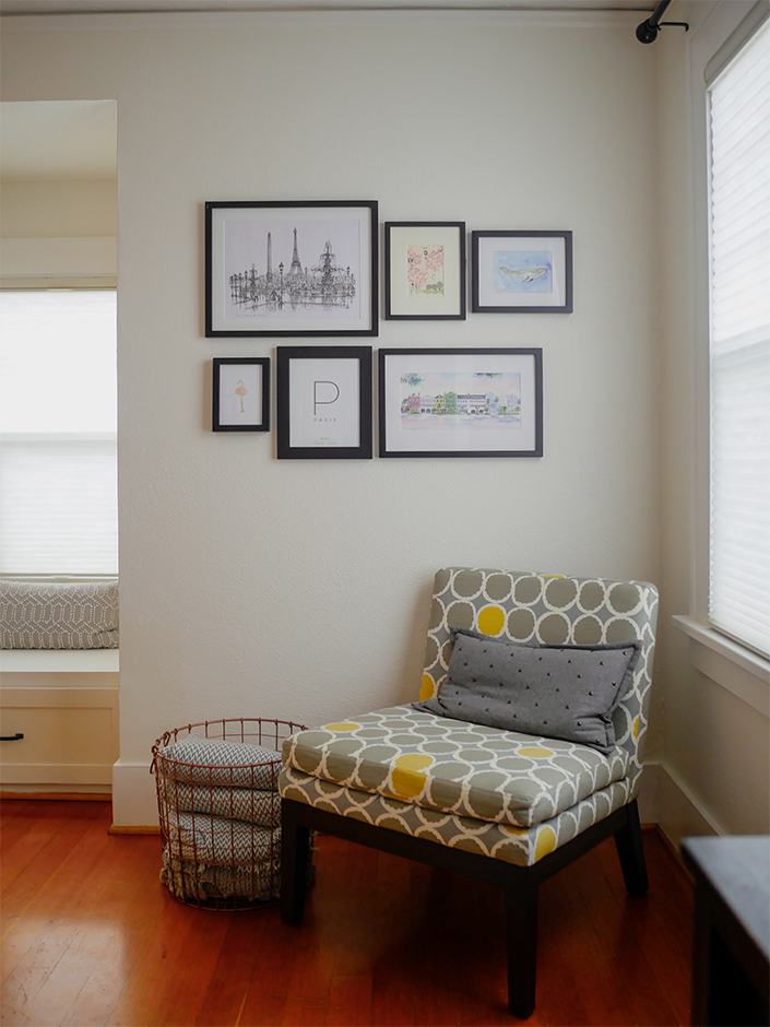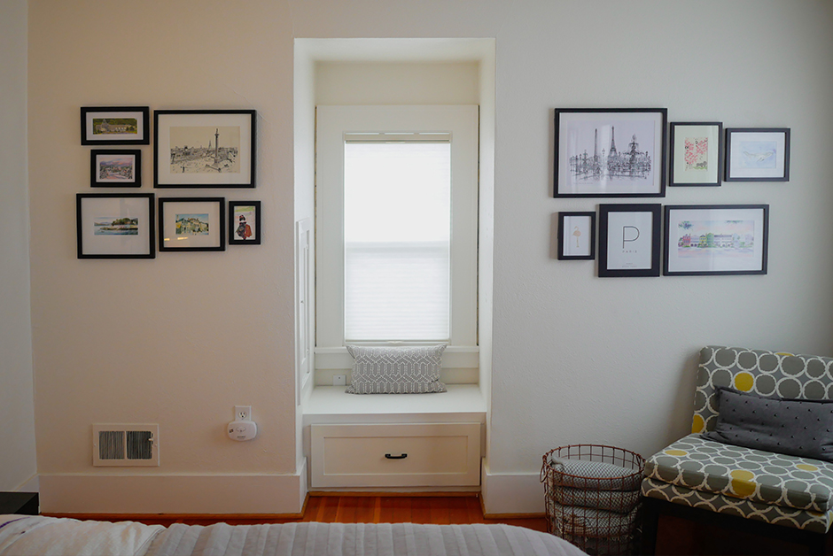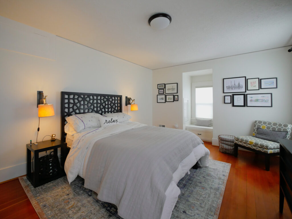
As we’ve been stuck at home a lot more this past year than in the past due to the pandemic, we’ve taken the opportunity to do a few touch ups to rooms in our 1925 Dutch Colonial house in Portland. While most of the large renovations happened the first year we moved in, we’ve spent this past year doing smaller updates and making other changes to spaces in the house that were fine, but just needed a little something extra. One of those spaces is our bedroom. As the largest bedroom, it’s a pretty corner room, has lots of light and beautiful original hardwood floors and moldings. Most of the furniture there is the same furniture that we brought with us from our townhouse, but we just felt like it needed a bit of an update without spending too much money or changing out too much. In the end, it really only took some art and a new rug to make a huge change in the space and I’m so excited with how it turned out!
Step 1 : What’s the Budget?
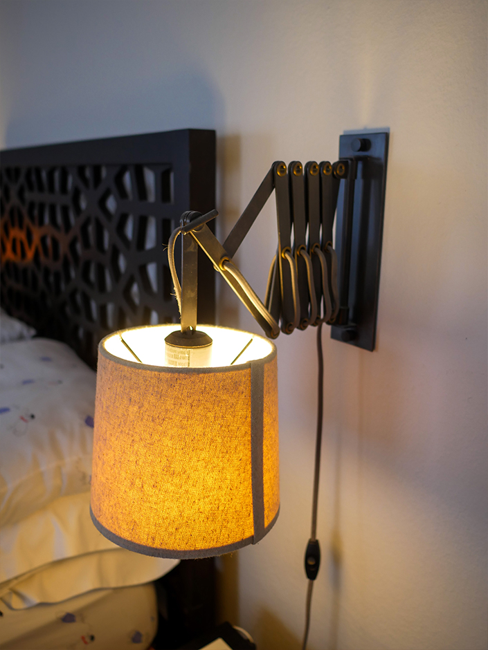
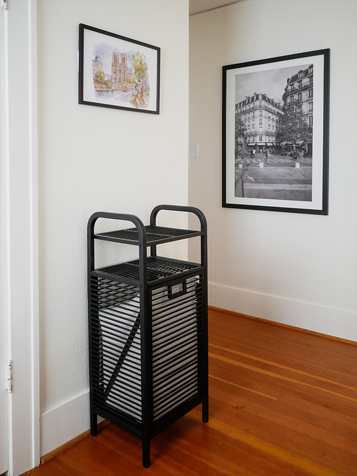
I really didn’t want to spend a lot in this room and I wanted to do only try out things that we could do ourselves and not have to hire out. We have spent some money on this room over the past couple years having our contractor build a window seat in the dormer window, replacing the lighting and I spray painted our hamper black to match the room better, but overall, this re-design was supposed to be low cost and easy. In the end, we spent only about $300 total for frames and a new rug to brighten up the space.
Step 2 : Think About Color
One of the features in our bedroom that I love is that artwork. We have an assortment of art in this room, from a large black and white photograph that Nick took of our favorite cafe in Paris, to a handful of local art from places we’ve traveled that I’ve turned into a gallery wall in the room. Most of the art in here is pastel pinks and blues so when looking for a rug, that’s the color scheme I was drawn to, alongside a base of gray that ties in everything else in the room.
Step 3 : Try a Couple Options
I ordered two different rugs in the size I needed (which was a strange 8’x8′ size) and when they arrived, I laid them both out in the space. Immediately I could see which one worked and which one didn’t (the one I didn’t choose was too blue). I do this a lot with rugs as it’s so important to see them in the space and then I return the one I didn’t use.
The Final Result
Overall, just a few minor changes really freshened up our bedroom and made it feel lighter and more mature. Eventually, I’d like to paint the walls a light gray but that project will need to be down the road due to our limited amount of time for house projects these days because of our crazy work schedules. All in all, I love the simple changes that brought this room alive and remind us of our travels.

